There’s many factors, honestly. For example, a lot of pixelated games have animations that break the “pixel barrier”, eg, a character moves smoothly over half pixels. Another thing is pixel scales being completely different. Sometimes a character or an icon has larger pixels than those on a map. Another factor is simply a variety of textures and colours- older games had limited colours for most objects, counting the underlying map as an object in itself. Not every colour could be used, and sometimes, a lot games weren’t actually on the same saturation as people remember.
Music will be another factor.
A reason to use pixelated graphics isn’t necessarily for nostalgia, it’s that it’s simply easier to make the game look good and consistent. Which is excellent for an indie game. 3d graphics could be more costly and higher res graphics are harder to look better due to the added detail. With pixels, your brain kinda just fills it in and it doesn’t go to the uncanny valley.
I think good examples are the likes of windwaker and thomas was alone. Both had simplistic art styles which wasn’t pushing the console to the limits, and both are beautiful games.
I remember when I had to make a game for an assignment. Other classmates were trying to go for realism humans and such, mixing and matching downloaded graphics and textures. It looked how you’d expect. The most detailed texture I used was a skybox, then made my own textures and models which were simply flat colours and neon green cones for trees and big boxes with ramps for hills. I then played around with the emissive properties until the lighting looked nice. I got good marks, the graphics were cited as a reason.
I digress,
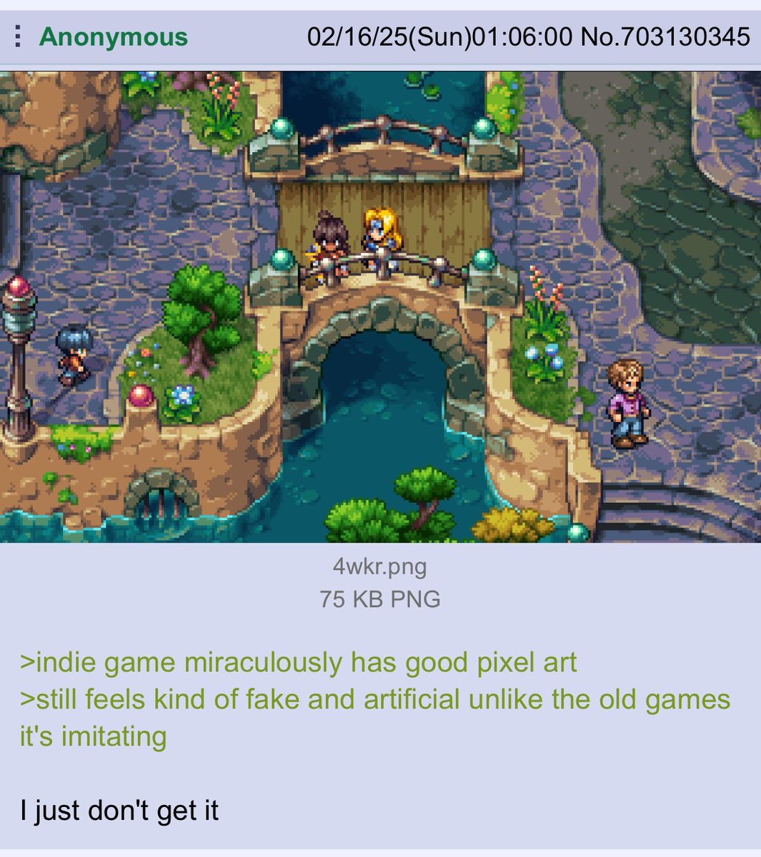
I think here the pixel art is too good, back in the day they wouldn’t have been making something so complex.
Another thing is pixel scales being completely different. Sometimes a character or an icon has larger pixels than those on a map.
Stardew Valley for the most part does pixel art right, but it’s always jarring to see the player character’s weird skinny fishing line. It’s worst when it’s juxtaposed with other characters whose lines are drawn correctly:
That massive fish is also a bit jarring. Usually SDValley kinda works though because of the tiling. Wasn’t that game also almost entirely made by one dude?
I think that fish (and the trout tag on the left side of the screen) may just have been screenshotted mid-catch. In the game, when you catch a fish you fling it through the air in an arc and then it lands in your hands:
That catch animation doesn’t show it, (maybe it’s from an earlier version of the game?), but I’m pretty sure the current version scales the sprite bigger and then smaller as it travels through its arc as sort of a 3D special effect.
It also depends on the system they’re trying to emulate the style of. This would fit fine in the PS1 “Of Mana” game. Too complex for SNES, which is what most people probably assuming graphics like this are going for.
It’s not just about looks. It’s about novelty, marvel giving way to generosity towards the crunchy parts of the design. And of course, a compelling story in a new world.

There’s many factors, honestly. For example, a lot of pixelated games have animations that break the “pixel barrier”, eg, a character moves smoothly over half pixels. Another thing is pixel scales being completely different. Sometimes a character or an icon has larger pixels than those on a map. Another factor is simply a variety of textures and colours- older games had limited colours for most objects, counting the underlying map as an object in itself. Not every colour could be used, and sometimes, a lot games weren’t actually on the same saturation as people remember.
Music will be another factor.
A reason to use pixelated graphics isn’t necessarily for nostalgia, it’s that it’s simply easier to make the game look good and consistent. Which is excellent for an indie game. 3d graphics could be more costly and higher res graphics are harder to look better due to the added detail. With pixels, your brain kinda just fills it in and it doesn’t go to the uncanny valley.
I think good examples are the likes of windwaker and thomas was alone. Both had simplistic art styles which wasn’t pushing the console to the limits, and both are beautiful games.
I remember when I had to make a game for an assignment. Other classmates were trying to go for realism humans and such, mixing and matching downloaded graphics and textures. It looked how you’d expect. The most detailed texture I used was a skybox, then made my own textures and models which were simply flat colours and neon green cones for trees and big boxes with ramps for hills. I then played around with the emissive properties until the lighting looked nice. I got good marks, the graphics were cited as a reason.
I digress,
I think here the pixel art is too good, back in the day they wouldn’t have been making something so complex.
Stardew Valley for the most part does pixel art right, but it’s always jarring to see the player character’s weird skinny fishing line. It’s worst when it’s juxtaposed with other characters whose lines are drawn correctly:
That massive fish is also a bit jarring. Usually SDValley kinda works though because of the tiling. Wasn’t that game also almost entirely made by one dude?
I think that fish (and the trout tag on the left side of the screen) may just have been screenshotted mid-catch. In the game, when you catch a fish you fling it through the air in an arc and then it lands in your hands:
That catch animation doesn’t show it, (maybe it’s from an earlier version of the game?), but I’m pretty sure the current version scales the sprite bigger and then smaller as it travels through its arc as sort of a 3D special effect.
it’s a mod
The massive fish (and several other on-screen elements) are modded additions, not from ConcernedApe.
That’s a great spot and I tried to picture it but couldn’t so I also appreciate the screenshot
It also depends on the system they’re trying to emulate the style of. This would fit fine in the PS1 “Of Mana” game. Too complex for SNES, which is what most people probably assuming graphics like this are going for.
It’s not just about looks. It’s about novelty, marvel giving way to generosity towards the crunchy parts of the design. And of course, a compelling story in a new world.
Also, 256 colours