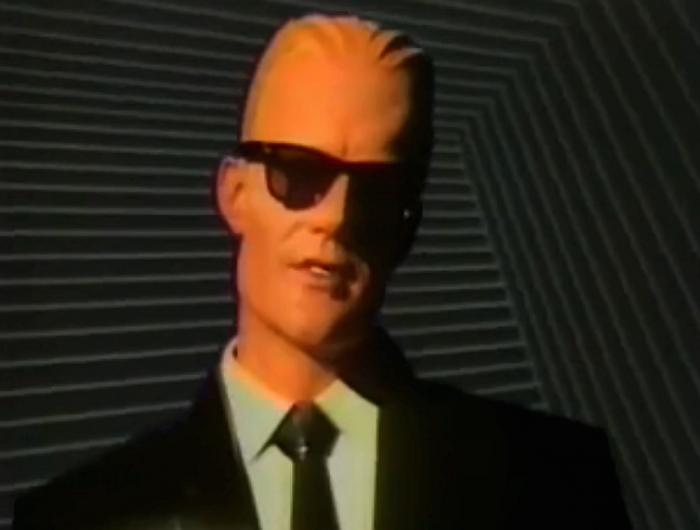
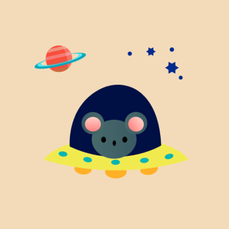
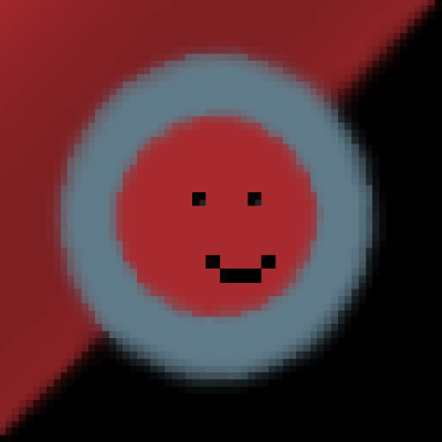
Yo guys, I’m working to recreate the original no profile pic from reddit (the one on the left) but without any color shades for now, and I came up with this pic (the one on the right), is it any good for you guys?
(I’m not a designer or in the industry at all) So I’m not that used to this kind of softwares, tell me how I could improve it and I will try my best to do so.
When I get a design that it’s good and liked by everybody, or at least most of us, I will shade it using the original colors or somethings that we like better and release it to use for free on Infinity
Its already been changed…

Whilst what you have done is nice, seems this area has already been Lemmyfied…
what you have done is nice, seems this area has already be Lemmyfied…
Ah gg
I like this more as it has a bit of color in it
The goal was first to make a good base and then to shade it like the original!
I like it!
Love it!
Really appreciated the response!
looks great
I like this a lot
Thanks for the feedback!
I’d recommend making the circle stroke width equal to the head’s stroke width, like in the original icon. Other than that it’s a perfect substitute imo
Like this?
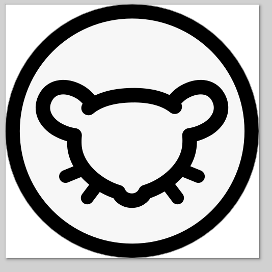
Tbh that looks a little heavy. I don’t think the strokes need to be the same width, but maybe making both thinner could work. It doesn’t need to be a replica-of-reddit-but-lemmy
There is no need anymore they have already made one before mine
I prefer yours as well. Maybe you can submit it to arcticons?
