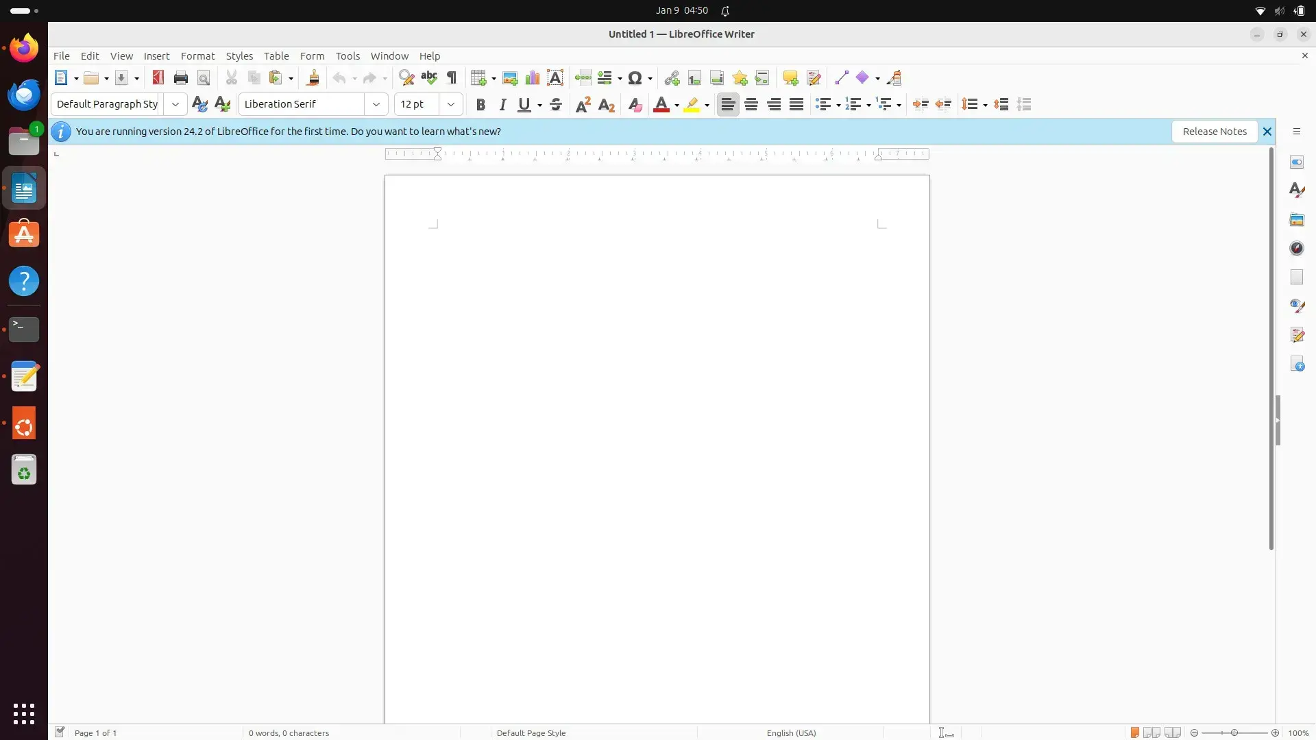
Why libre office hasn’t adopted the tabbed many bar yet is beyond me ! They are probably not gonna be sued by Microsoft. It is just a huge ux improvement and would ease the friction for new comers especially that everyone is used to using tabbed bar on every other software.
I actually prefer it that way. With tabbed Ribbons (Is it how they’re called?), I constantly have to look over and over again which tab the thing I need is located, ending up in question why X is put here but not there.
Have you trued their grouped mode (I think that’s what it was called?) It does well to combine the benefits of both last I saw it!
It has it as a setting. It should be default though
They have it, it’s a setting
I know. I was talking about making it default. As many newcomers won’t know about it’s existence first hand, and give up on it
it has that as a setting, but it more of an afterthought
Is this tabbed user interface what you’re asking for?
https://books.libreoffice.org/en/IG72/IG7212-UserInterfaceVariants.html#toc8Yes some call it tabbed menu. Others call it ribbon menu. It should be the default as many users nowadays are used to this UX paradigm
Based on this comment section, it isn’t all that clear which one should be the default… probably a compromise could be made by adding a more obvious way to switch between the modes.
“improvement” lol xD
I hate that BS with a passion. Never find anything I need and always spend way more clicks than needed for simple tasks.
It improves discoverability for new users, just like having menus and submenus instead of a single list of commands, or just a command prompt.
If you’re used to the old ways, of course it doesn’t help… and if you know your shortcuts or command line commands, even a menu becomes a hindrance 🤷
And try as I might, it still looks horrible 😔
I love it and use it all the time, especially calc. But one thing I’d really like to see is a fix for the fact that the icons up top look absolutely horrendous on high DPI screens, no matte the icon theme used (svg or not).


