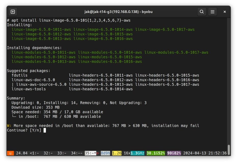
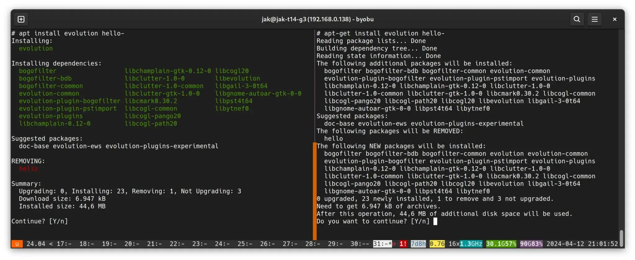
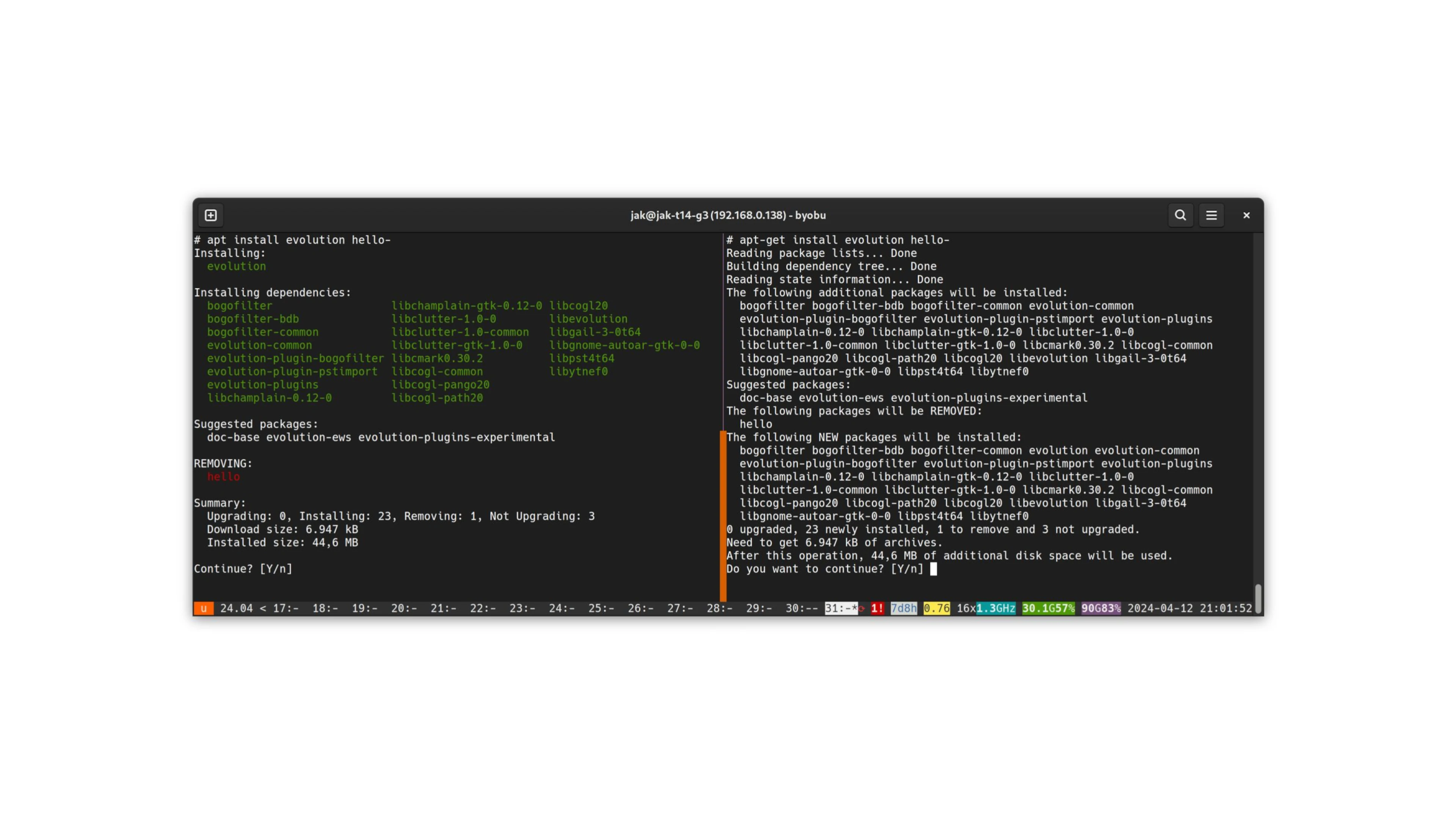
I have one minor complaint based on that screenshot: “Installed size 44,6 MB” does not have the same meaning as “After this operation, 44,6 MB of additional disk space will be used.”
It’s okay to have it use fewer words, but it should not be at the expense of accuracy.
Agreed.
Maybe it could be “Installed size +44.6MB” to clarify without taking too much space.
I don’t really feel the UI is the problem with APT. It is more stupid errors that do not give enough detail such as the dreaded “but will not be installed” nonsense where you manually have to then try to install that package to see why or the issue with post-install scripts failing leaving the package manager in a bad state.
Dumb error messages like that have to do with the UI and UX. The user interface (UI) in APT has mostly to do with how easily users see, recognize, and understand descriptions of errors (that is, how text appears and is organized), and the user experience (UX) in APT has to do with how easily users can, say, follow-up, within the tool, to resolve those errors.
An example of a better UI in APT could be grouping to-be installed packages with clear linebreaks and color, or highlighting how much space is to be used by bolding it. All good stuff that isn’t gonna kill my eyes when I have to scroll around to find what was / wasn’t installed properly.
And that scrolling around is all about the UX. An example of a better UX could be installation bars rather than percentages to keep the screen from scrolling past errors too quickly, affordances for users to make decisions within APT to resolve dependency issues without it dropping back into the terminal (again, dumb error messages), or providing help within the interface without having to back out to the terminal and use APT with an operator.
I think it would be great to keep those error messages you mention, like, front-and-center, even after an operation has wrapped up. Who wants hunt/grep through a full log?
Nala?
Nani?!
“Nani” is Japanese (in Romanji form) for “what”, and in internet culture has become a common phrase of exclamation when someone is confused. It comes from the popularization of anime in American culture, but also in internet culture as a whole. In this context, it is equivalent to asking “What?” or “Huh?”. The user you replied to likely does not know what Nala is and was expressing their confusion in their comment. It’s doubtful they were replying to your comment about an apt frontend with a Python array library that hasn’t been updated in 7 years.
Lol
Holy shit, 35 tmux windows?! That’s insane.

Hopefully using tmux resurrect so that they just have persistent sessions at hand.
I can see it as a way to know that “17” is htop to high importance server X, 23 is pinging Server Y, etc.
I just want to see “from” and “to” versions when upgrading.
Content mills…
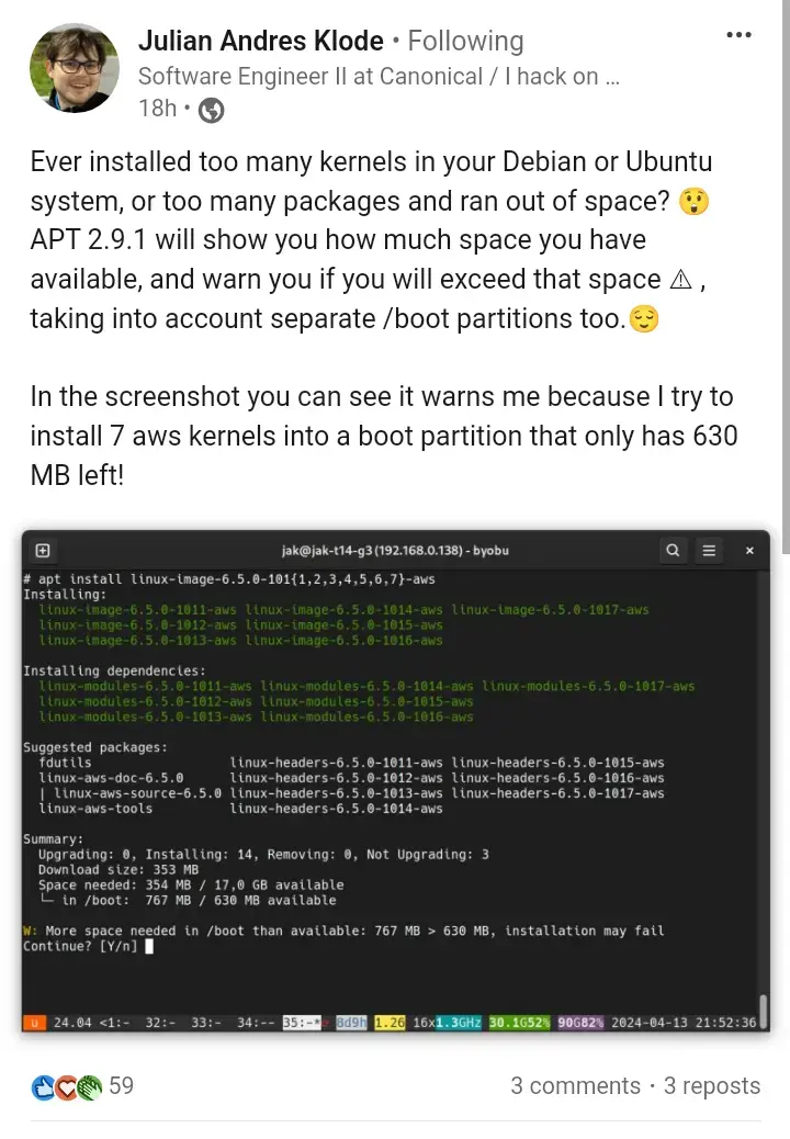
Just go to the source. The dev is sharing more info and videos. Sure, it is on LinkedIn which is rubbish but at least it isn’t 9to5Linux


Ooh, I really like that footer. Is that something running in a single-row multiplexer pane? Either way, what is it?
Edit: is that just a core feature of tmux? I’ve been missing out.It looks a lot like byobu
Here is an alternative Piped link(s):
https://piped.video/watch?v=h96VqpbUAk8
Piped is a privacy-respecting open-source alternative frontend to YouTube.
I’m open-source; check me out at GitHub.
About time, that is much more legible.


